


Did you know...that colours revolutionised art and our perception of the world?


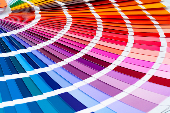
Colours of every imaginable hue and shade permeate our vision and form our perception of reality.
Colours of every imaginable hue and shade permeate our vision and form our perception of reality.
The ability to perceive colour is integral to a full experiential understanding of the world around us. Colours are the medium by which artists create stunning masterpieces. As well as helping us to move through the world and enabling a sense of enjoyment and wonderment at visual stimuli, colour also has a deep and quite remarkable effect on our psychology.
How We Perceive Colour
The exact process of how we perceive colour is still not entirely understood. What we do know is that our perception of colour is caused by light reflecting from an object. Surprisingly, objects themselves do not inherently have colour. The colour of an object depends on the wavelengths of the light that is reflected back to us.
As light enters the eye, photoreceptor cells cause an electric signal that is sent to the brain. The brain then processes the signal and interprets it as a colour. The intensity of a colour is determined by how much light there is. The brain adjusts for lighting conditions to provide us with a consistent colour experience in a variety of lighting conditions.
Different light wavelengths are interpreted by the brain in different ways. Red, for instance, is one wavelength. Green is another. When both red and green wavelengths are simultaneously signalled to the brain, we see the colour yellow. The intensity of light affects how vivid our perception of colours is. In low lighting conditions, green and blue objects can seem brighter than red objects. When an object absorbs light, we perceive it as the colour black.
How Colour Impacts Our Psychology
Our brains don’t just interpret colours, they attach emotional reactions to them. Some of these reactions are learned, such as associating red with danger or heat because it is the colour of blood and fire. Likewise, white and blue are often viewed as cold colours.
But we also attach symbolic meaning to colours. When a person is angry, they ‘see red’. When someone is sad, they ‘feel blue’. Some colours have a calming effect on us, like blue and green. Others, make us feel anxious or afraid like red and black.
Cultural norms also play a part in how we react to colour. Black is the colour of mourning in the West, but for many other cultures, it is gold, white, or purple.
The Use of Colour in Art
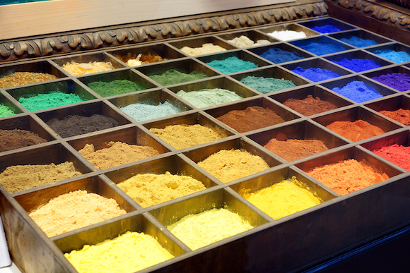
Our first use of colours in artworks can be traced back over 40,000 years when humans mixed soil, charcoal, chalk and animal fat to create pigments. Since then, the creation of new pigments has brought about a series of revolutions in the art world. Almost every major artistic development from the Renaissance onwards has been marked by the creation of new pigments.
Red is perhaps the oldest manmade colour and was used in cave paintings by prehistoric peoples. In the 16th to 17th centuries, red pigment was made from a rare cochineal insect found only in Mexico. The strange source of red pigment made it one of the world’s most valuable resources. Grandmasters like Rembrandt would paint layers of red cochineal pigment over cruder red ochre to achieve a deep, rich intensity.
Blue was often associated with religion, as it was derived from lapis lazuli, a gemstone that for centuries was only found in Afghanistan. The highly expensive ingredient remained the standard for creating ultramarine blue pigment until the 19th century. Famously, Yves Klein and a Parisian paint manufacturer created a synthetic blue in the 1950s.
Some pigments were downright dangerous for artists. A shade of green known as Scheele’s Green became popular during the Victorian era, even though it contained deadly levels of arsenic. Scheele’s Green was eventually replaced by Paris Green and used by Cezanne, Monet, and Renoir. Unfortunately, Paris Green was also toxic and may have caused Monet to go blind. The use of Paris Green was banned in the 1960s.
The art world has always been quick to react to new pigments. Although not all colours were popular. Yellow was never a widely used colour except by luminaries such as Van Gogh and Turner. And they were pilloried by critics for it. A standalone version of purple called Manganese Violet so impressed the Impressionists that Monet was accused of having what a critic called ‘violettomania’.
New pigments are still causing controversy. The artist Anish Kapoor was widely criticised for maintaining exclusive rights to the blackest pigment ever made, Vantablack. One famous response was from Stuart Semple who created a shade called Pinkest Pink and made it available to anyone in the world, except Anish Kapoor.
The deep understanding that artists have of the impact of colour on human psychology allows them to create moving artworks. As new pigments are developed, artists will continue to find new ways of harnessing the emotional power of colours.