
Paper Whiteness Changes
How We Perceive Colour

How white a piece of paper is impacts how we see colour. Antalis explains how this curious phenomenon works and why it matters for your projects.
How white a piece of paper is impacts how we see colour. Antalis explains how this curious phenomenon works and why it matters for your projects.
Did you know… the whiteness level of paper changes how we perceive colour?
Plain white paper is perhaps the most common type in use. Simple, elegant, and practical, white paper is used for everything: brochures, leaflets, catalogues, packaging, artworks… But what qualities should you look for in a sheet of white paper?
Choosing the right type of white paper might not seem like a big deal, but there’s a bit more to it than you might think! Thickness is important, but how white the paper is also makes a difference.
The whiteness level of paper changes how we perceive colours. A bright white background makes colours stand out, while warmer shades of white soften tones and reduce contrast.
Making the right paper choice will make your colours more flattering, produce a better quality print, and help you achieve the impact you’re aiming for.
In this blog, we’ll shed some light on the role that whiteness plays in how we see colour hues. We’ll also provide some top tips on how to choose the right type of paper.
How does paper whiteness impact our colour perception?
Have you ever thought about the difference that the hue of the paper makes? It’s quite possible that you haven’t. But perhaps you should.
And here’s why: the hue of a sheet of white paper directly impacts how our eyes and brains interpret colours. In turn, this affects how easy it is for us to read text or view images. It also changes how bold and striking colours appear in print.
There’s some pretty solid science behind why this happens. Our eyes don’t just register colour in isolation. They interpret colours relative to the brightness of the background. When our eyes see a stronger contrast, colours appear more vivid and saturated. This all has to do with how much light the surface of whatever we’re looking at reflects into our eyes.
A very white paper will reflect more light back to our eyes, providing greater contrast. That’s why colours tend to look more intense on whiter paper. Conversely, duller or slightly yellow papers reflect less light, so the colours will seem more muted.
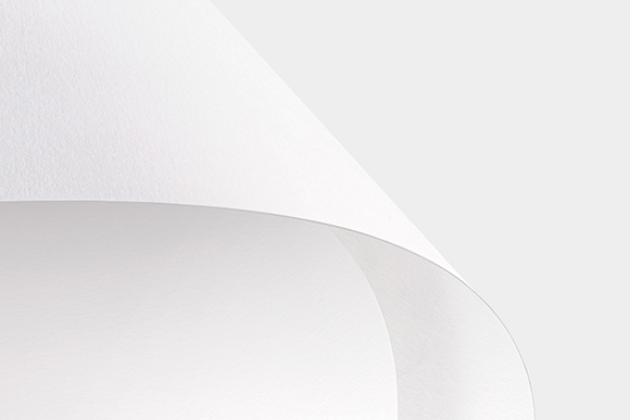
Olin Design white paper
Why is the whiteness level of paper a big deal?
Choosing paper based on its hue makes a huge difference to the outcome of your printing project. Paper hue can make colours seem richer, duller, lighter, or darker. It’s all to do with the fact that white paper isn’t blank. And it isn’t really white, either.
All white paper is tinted by the materials and treatments used during the manufacturing process. This tinting is deliberate. Most papers have a natural off-white or yellowish tone. To change the whiteness level of the paper, manufacturers add optical brightening agents that absorb UV light and re-emit it as blue light. This tricks our eyes into seeing the paper as a cooler, brighter white than it really is. That’s why different types of paper can look warmer or cooler, in spite of the fact that they’re all sold as white.
For example, slightly cream or ivory papers will imbue colours with a warmer, softer appearance. Paper that has been given a bluish tint will reflect more light and make colours appear sharper and bolder.
Want to produce a strong, vibrant work with vivid colours that jump off the page? Go with a whiter paper. However, if you are looking for a softer, subtler effect, you’re better off with a paper that has a duller hue.
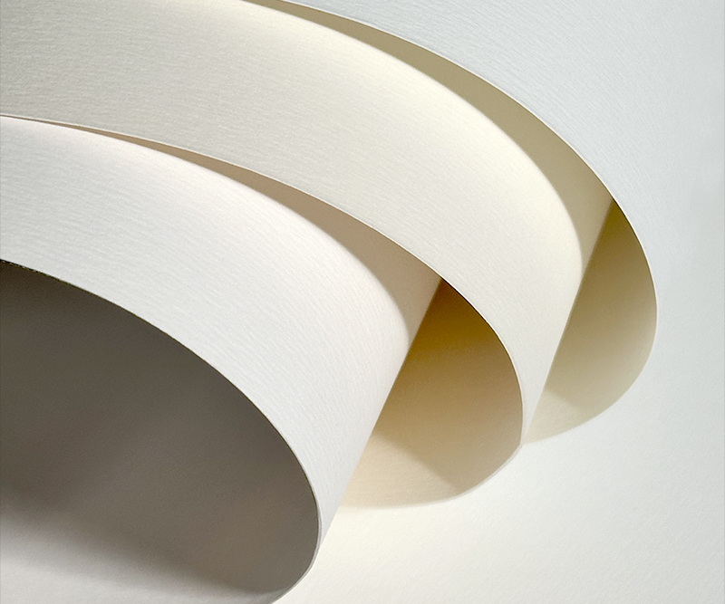
Rives Sensation papers, available in Bright White, Natural White and White 100% recycled
How to choose the right type of paper
It’s difficult to spot subtle changes in colour shades by just looking at a piece of paper. That’s why the industry developed standards that can be used to gauge how white paper is.
The standards ISO 2470-1:2016 and ISO 2470-2:2008 measure the diffuse blue reflectance factor of paper, known as ISO brightness, under typical indoor and outdoor light conditions. There are also the CIE whiteness measurements, which gauge how white paper looks to the human eye. Because CIE whiteness is based on our perception, it is currently the most common method used in the printing industry.
The CIE whiteness scale typically ranges from around 80 to well over 150. The higher the number assigned to the paper, the whiter it appears. Typical multipurpose office paper usually falls between 120 and 140, which is considered a moderately white level. Paper that measures above 150 on the CIE scale is classified as high-whiteness stock. These papers are commonly used for photographic prints, communication materials, and reports.
Papers with lower CIE whiteness values are often chosen to reduce glare, soften colours, or make certain hues stand out more clearly. Stationery, art prints, and many books frequently use paper with lower CIE whiteness values.
Natural shades of white provide a gentle, soft background that makes it easier for our eyes to read text, Olin Design Soft White papers are highly recommended. For reproducing skin tones, pigmented papers like Rives Sensation Tactile will offer the best and most natural print rendering.
From everyday office paper to premium materials designed to elevate every print, Antalis offers a wide range of papers perfectly suited to all your projects. Available in an endless variety of textures, whiteness levels, and standards of excellence, our collection provides a true palette of expression, helping every project, from the simplest to the most refined, find the paper that reflects its essence.