
Catherine Zask
France
"The pleasurable sensation that you experience when handling paper becomes associated with the message printed on it."
Graphic artist, poster designer, writer – Catherine Zask is as multifaceted as the building blocks of her visual language. A graduate from the Paris ESAG in 1984, she established her independent practice in 1985. She works with institutions and private companies, creating their visual identity and designing various aspects of their promotional material for which she combines writing, typography, drawing, video and photography. Among her clients are L’Hippodrome, the National Theatre of Douai; the French Ministry of Culture; the University Paris Diderot; the Prix Emile Hermès; and La Scam, the Civil Society of Multi-media Artists. In 1993-94, during her residency at the French Academy of Rome (Villa Medici), she created Alfabetempo, an experimental notation system based on decomposing the beats of letter strokes. This work continued the research she had begun ten years earlier on letter, tracing and sign: Alcibiades, Doodles (Gribouillis), Radiographies de pensées, Sismozask, Cousu-Zask, the Iris Project, or Happy Dots. She teaches and lectures in art schools in France and abroad. She has had many solo exhibitions and has won several awards, including the Grand Prix at the 20th International Biennial of Graphic Design in Brno, in 2002. In 2010, she received a prestigious distinction from the French Ministry of Culture, the Chevalier de l’Ordre des Arts et Lettres medal. She is a member of the AGI, the Alliance Graphique Internationale.
Catherine Zask’s spacious Paris studio looks more like a gallery than a workspace. When you enter, the first thing you see is her black and white graphic work displayed on white walls. Take a few steps forward to have a closer look and you bump into long tables on which artifacts are arranged in neat rows: multiple white cards imprinted with iterations of a same spiky motif, pieces of bark buffed and polished, or pens and pencils lined up like so many brush strokes. Hanging from a track in a corner of the studio are her famous posters. From the corner of your eye you can identify her Macbeth, a monumental black and gold masterpiece for the Douai theater, and just behind the striking yellow presence of one of her Scam “manifestos.”
Catherine Zask’s personal and professional work is a seamless construct. Other designers make a point of separating their artistic from their commercial work, to emphasize the fact that they are first and foremost competent problem solvers, but not Zask. Few people are as knowledgeable as she is when it comes to typography, design and print production, yet she never flaunts her competence and expertise. Clients come to her for her distinctive typographic approach characterized by an economy of means, rigorous compositions, and handsome letter-forms orchestrated with consummate panache.
A passionate collector of everything made of cellulose fibers, she treats every scrap of paper she finds as if it were special. She also writes about her love affair with wood pulp. In a recent collection of her remarks on the topic, published under the title Casual Drawings, she says that part of her creative process involves manipulating and appraising pieces of paper until one of them whispers to her: “Take me!” Only then can she begin to draw and explore the contours of her conceptual thinking.
Véronique Vienne
Interview
Véronique Vienne:
Why is the texture of paper so important in your work?
Catherine Zask :
My job is to create documents that people not only want to read but also want to keep. To that effect, I try to combine sight and touch. Both senses are necessary, in my opinion.
Imagine, for instance, an invitation printed on paper that is coated on one side and uncoated on the other. On the coated side, the colors are fresh and vibrant, while on the uncoated side they are matte and velvety. Your fingers can tell that the two sides are not the same. There is a difference between recto and verso. There is a front and a back. It’s palpable. Hands have an intelligence of their own. I try to make the most of their ability.
Granted, it’s a small difference. But the subtle pleasurable sensation that you experience when handling two-sided paper becomes associated with the message printed on it. The slight tingle at your fingertips eases your nerves and uplifts your mood. In contrast, when you get an invitation that is printed on ordinary paper covered on both side with the same boring acrylic varnish, you are more likely to just glance at it before tossing it into the wastebasket.
How did you learn to evaluate paper?
I collect all sorts of papers. You could say that I am a scavenger at heart. I am always salvaging and reclaiming old envelopes, wrapping paper, scraps from discarded notebooks, blotters, industrial papers, cigarette paper, pieces of cardboard, you name it. I also get paper samples from professionals in the packing and moving business, from bookbinders, from electricians, from building contractors, or from people in the garment industry: I find stuff like paper used to pleat fabrics, or cardboard to insulate wires.
I experiment by printing and drawing on these found treasures. I test different printing techniques on various quirky surfaces. As much as possible, when I am working on a specific project, I get on the phone and pick the brains of printers, paper representatives, and distributors of special papers.
At what point of the creative process do you select the paper?
Early in the process I let my mind wander. I jot down ideas. I experiment on the side with various papers. Only later do I call the paper representatives with whom I have a relationship and describe to them what I have in mind. Maybe I am looking for a very thin paper that’s shiny on one side and matte on the other? We talk. They make some suggestions. They help me think it through.
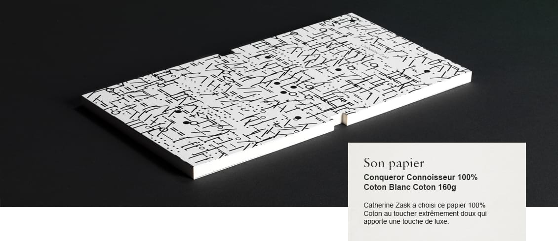
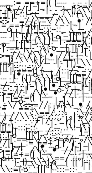 Title - Languazask
Designer - Catherine Zask
Date published - 2012
What are some of your favorite papers?
I do not have a favorite paper – the ultimate choice depends on the design, the client’s personality, and the message. However, I know what I don’t like. It breaks my heart, for instance, when I see a beautiful offset paper ruined with acrylic varnish recto verso.
Why would anyone apply acrylic on uncoated paper?
Acrylic varnishes, whether matte or shiny, protect the printed surface from smears, stains or dust. Applying it safeguards the final result against smudges. It’s considered more economical in terms of production because the job always comes out looking pristine – even though the specific varnish eradicates the tactile dimension of the paper. The end product doesn’t even look like paper anymore!
So, how do you preserve and enhance the tactile quality of paper?
My way of working is to match a specific paper with a distinctive printing technique. Once, I tried hot foil printing on blotting paper. Another time I might want to experiment with matte printing on flocked paper.
One of the looks I like most is a solid luscious color printed on uncoated paper. But it’s quite a feat, technically. To get the best result, a printer sometimes has to try every trick in the book, including coating his rollers with thick layers of ink. It is particularly difficult with black ink. Black surfaces are known to smear. I don’t know many printers today who can pull this off.
I had assumed that advances in printing technologies gave designers more creative options.
In theory, yes. But presses have become so sophisticated – and so expensive – they are not profitable unless running at high speed, and preferably with the four-color process. As a result, printers today are weary of trying anything that might slow them down, such as special requests for customized mixture of colors.
Sadly, technology has eliminated risk-taking. Everything has to run smoothly, since all the steps of the printing process are now interconnected. From the client’s carefully worded brief to the tightly scheduled delivery date, there is a long chain of precise operations that are contingent on each other. If one thing goes wrong, the entire project will flounder. Fumbles have to be eliminated.
So, how do you remain creative?
Sometimes being creative feels like trying to plant flowers in gravel. But I don’t give up. I keep my relationship with paper very much alive thanks to my personal work. I fill notebooks with drawings, sketches, doodles, scribbles, and ink smudges. At the same time I attract clients who know that I can propose unusual design solutions. I have a reputation for experimenting, and for some projects this approach makes absolute sense.
That said, what is the place of digital technology in your work?
I love paper, but I love computers as well. They have liberated us from the tedious obligation of doing what we used to call “mechanicals” or “paste-ups” – the complex, camera-ready layouts assembled by hand with wax or glue. Today, I can begin my creative investigation on paper, but I am just as likely to sit in front of my computer and start exploring forms right there, directly on the screen.
I am constantly tweaking my digital tools – hardware, software, applications, or anything that allows me to take pictures, create animations, or add sound to images. Loving paper as I do is not an obstacle to enjoying the convenience and pleasures of being electronically connected.