
© Nino Andrès
Elaine Ramos
Brazil
"The paper will determine the flexibility of a book – it’s a critical choice."
Elaine Ramos, known in Brazil but also on the international design scene for her flawless graphic work, graduated from the Faculty of Architecture and Urbanism of the University of São Paulo in 1999. A graphic designer as well, she became, in 2004, the art director at Cosac Naify, the main publishing house in Brazil dedicated to visual arts. There, she is not only responsible for the design of more than a hundred books, she also coordinates all the releases of titles about design, many of them translations into Portuguese of classic texts, such as Philip Meggs’ A History of Graphic Design. Concurrently, she is developing original books, including a comprehensive history of Brazilian graphic design, Linha do tempo do design gráfico no Brasil. For it, she has assembled more than 1600 images, evidence of two centuries of Brazilian creativity. She is a member of the AGI (Alliance Graphique Internationale) since 2012.
In bookstores in Rio, Salvador, Brasilia, or Sao Paulo, the books designed by Elaine Ramos and her team stand out. Something about them entices the eye but also the hand. It’s not just their colorful typographical excellence – that’s not so unusual in Brazil where graphic design is practiced by very talented professionals – it is another quality, much more difficult to identify. “My approach is always structural,” says Ramos. An established architect, she designs from the inside out rather than from the outside in. In other words, she begins with the content. With the feel of the book as you open it. With the reading experience as you turn the pages. And with the paper on which text and images are printed.
A Modernist at heart, Ramos is also heiress to a Portuguese tradition that goes back centuries. In the past, in Portugal but also in Brazil, inexpensively printed books were sold in outdoor stalls, “on a string,” hanging like laundry on a clothes-line. The equivalent of “pulp fiction,” these humble publications belonged to a literary genre accessible to all, known as Literatura del Cordel. Illustrated with beautiful woodcuts, the popular booklets were often written by local poets who promoted their production by singing or reading aloud to large crowds in open-air markets. Ramos, unwittingly perhaps, keeps alive this vibrant heritage with affordable books that incorporate a poetic dimension. Her creations often feature playful flaps, unexpected folds, elegant inserts, and creative paper variations.
Design para um mundo complexo, (Design for a Complex World), by Rafael Cardoso, is an example of how she turns paper into an interactive feature. The book is wrapped in a thick folded poster that serves as an external jacket. When you open it up, it reveals a bright blue, glossy soft cover. Also playful is Zazie No Metrô, (Zazie in the Metro), by Raymond Queneau. Printed on translucent bible paper, it looks at first glance like a pile of bundled pages. It is illustrated with French period posters, printed in the back of the pages, ghostly images providing a mysterious visual buzz. Another handsome specimen is Conversas com Paul Rand, (Conversation with Paul Rand), by Michael Kroeger, whose cover is a striking green and purple typographical composition. Inside are thick colorful pages, bristling like the quills of a porcupine.
Never showy, produced with a minimal amount of expenses, the books Elaine Ramos designs are artful collectibles, ordinary yet precious. Brazilian readers are lucky people, indeed.
Véronique Vienne
Interview
Véronique Vienne:
Would you say that you are a true Modernist – not just someone working in that “style”?
Elaine Ramos:
Your designs have no “style,” but they have a lot of personality!
No “style” doesn’t mean that my designs have no soul, or that they are neutral. I try to make my work discreet enough not to eclipse the content, but interesting enough to make a difference. Each of my books belongs to a specific edition, with a specific personality and must stand out as such. Finding the balance is not easy. On one hand I am influenced by Modernist ethics, on the other I don’t believe in neutrality.
Do you use computers to create the visuals in your books?
I do all my work on a computer. I think through the computer, it is the tool I am most familiar with. I’m terrible with manual skills, my approach is much too conceptual. One important input to my designs is discussing with the design team, the editors and the authors. I come up with better ideas when I am talking than when I am drawing!
You design on a screen, yet the typography of your books doesn’t feel computer-generated. Can you explain why?
Maybe because, for me, typography is never an end in itself. My choice of typeface, and what I do with it, is always a means to communicating an idea, or a content.
It’s the same with paper. I think of the texture of the paper as an essential piece of information to share a message, an idea, a concept or an impression with readers. Printed matter in general is dependent on the paper on which it is printed. When it comes to books, this choice is even more complex and absolutely fundamental. In addition to the tactile quality of each page, the paper choice is strongly connected to the weight, to the volume and, most importantly, to the flexibility of a book.
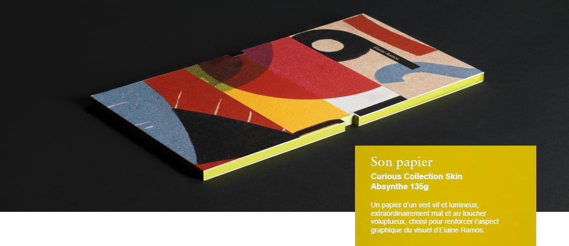
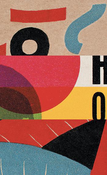 Title - Detail from the cover of Linha do tempo do design gráfico no Brasil
Designer - Elaine Ramos
Date published - 2012
Client - COSAC NAIFY
The flexibility?
The pliability of paper is very important. But it is never an isolated factor. When we talk about books, many elements must be orchestrated. The flexibility depends also on the format, on the binding, on the number of pages, etc. Flexibility is connected to the weight of the paper, and the weight of the paper is connected to its transparency. The transparency is, in turn, connected to the layout and the content of the book. For example, Zazie no metrô is printed on bible paper – even the cover. It is part of the initial concept, the design takes advantage of the paper’s flexibility as well as its transparency. I wanted the book to be elusive, to evoke the dreamlike quality of the narration. The cover is as flimsy as the book itself.
At what point do you design the cover of a book?
Usually the cover is the last element I would design in a book. I proceed from the inside out. The ideal cover is a synthesis of everything that’s inside, that you cannot see. It is a logical continuation of the internal design and, at the same time, it should draw the attention of people who browse in the over-stimulating context of a bookstore.
A good cover captures the essence of the book. It just sits there, quietly, patiently – but its visual appeal is the result of a series of very careful and deliberate design decisions.
In the introduction to your book, Steven Heller writes “I had no idea Brazil had such a long design legacy or was as stylistically rich and conceptually astute.” In your opinion, what is the most singular quality of Brazilian graphic design?
It is always so difficult to answer that question. Sure, the European and North American influences are visible at first glance, but it is more complicated than that. Brazilian design has an identity of its own, with Alexander Wollner its most acclaimed pioneer. He had studied at the Ulm School of Design in the 1950s before coming back to Brazil where he promoted the sobriety and simplicity of lines of the Concrete style initiated by Max Bill. Later, in the 1960s, the modern, geometric, minimalist, functional axis based on the Bauhaus philosophy coexisted with popular art, and with the pop influences of the “Tropicália” movement, as incarnated by the great Brazilian graphic designer Rogerio Duarte.