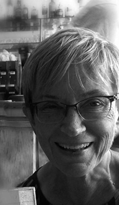
Kati Korpijaakko
Finland
"Better, heavier, and glossier paper was the ultimate reward."
Finnish editorial designer Kati Korpijaakko is much admired by magazine art directors worldwide for her strong design sensibility, in the Scandinavian modernist tradition. In Finland, she worked for the magazine VIKKO before coming to the United States in the early 1970s. After a decade art directing smaller magazines like Art News and New Jersey Monthly, she landed a job at the celebrated feminist monthly Ms. Magazine where she demonstrated her typographical flair and attracted the attention of talent scouts at Condé Nast Publications. From 1983 to 1988, she was at Mademoiselle; from 1988 to 1998, at Glamour; and from 1998 to 2004 at Self – three fashion and lifestyle magazines with a circulation of over a million. She now shares her time between Finland and the USA, and is building a career as a contemporary artist using mixed media including fiber, paper pulp, wax, and ceramic.
Kati Korpijaakko remembers the days when being a magazine art director meant handling paper all day long. Back then, editorial designers used their sense of touch every step of the way: assessing the quality of a photographic print, managing bulky typesetting galleys, doing quick sketches, designing page layouts, trimming pictures, pasting down headlines and copy, or checking printer’s proofs. “Our hands were never idle,” she recalls. “And paper was everywhere, on every surface, on every desk, and in every drawer.” Born in Finland – the country that is one of the biggest producers of paper in Europe – she grew up among the sawmills. Where she comes from, people are familiar with all the byproducts of the timber and pulp industry. They know paper the way the French know wines. Korpijaakko is no exception. When she was in charge of the design of Mademoiselle and Glamour in New York, she kept asking the production department to purchase better paper from Finland. “The prestige of a fashion magazine is intimately associated with the brightness of the paper on which it is printed,” she notes. “The shinier the better.” As her magazines’ sales figures improved, so did the quality of their paper. For Korpijaakko, better, heavier, and glossier paper was the ultimate reward for her magazines’ high performance at the newsstand.
Today, back in Finland during the summer months, far from the glitzy New York magazine scene, she works as an artist, with paper still her favorite medium – but now nature is her primary source of inspiration. There, in her quiet studio on a hill, in a remote part of the country near the Russian border, she creates three-dimensional collages, mixing textures and techniques. She designs light fixtures, vases, and paper pulp sculptures. “What I do today is more personal than what I did as an art director. Yet, come to think of it, the layouts I did back then were very personal too.”
Véronique Vienne
Interview
Véronique Vienne:
You were active as a magazine art director “before” computers, but also “after”. How did you negotiate the transition into the digital age?
Kati Korpijaakko:
Did you ever design magazines in a “paperless” office?
With the advent of computers, paper didn’t completely disappear. But what was gone was the joyful busyness and the camaraderie of the pre-digital age. For the first twenty-five years of my career as a magazine art director, when we were still designing magazines by hand, I seldom sat down. We all worked in a communal art room, standing up, in front of high slanted desks, like architects’ tables. Moving around. Fetching stuff. Walking back and forth. Telling stories. You’d think that it was physically grueling, but it wasn’t. Boy, it was fun! We worked hard, but, at the same time, we felt like spoiled brats, employed as we were by one of the most prestigious magazine companies on earth.
Did the quality of the magazines suffer when computers were introduced?
What suffered most was our health! The art department became a sedentary place. We lost all the exercising and socializing. We grew love handles from sitting on our behinds all day long!
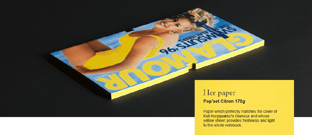
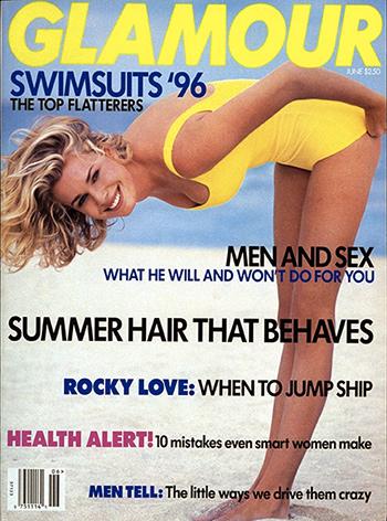 Title - Glamour Cover
Designer - Kati Korpijaakko
Photographer - Paul Lange
Model - Rebecca Romijn
Date published - June 1996
Client - Condé Nast Publications
What other changes did you notice?
What changed magazines most was not the paperless technology. Sure, some designers and art directors went crazy with software like Photoshop or Illustrator, but at Condé Nast, the difference in design wasn’t perceptible at first. No, what changed magazines was the Internet, the tablets to be more specific. New reading habits have been the biggest factor influencing the redesign of magazines.
I am a good example: I love paper and prefer the printed versions of magazines, but I read magazines online. As for fashion magazines, I only read them at the hairdresser, when I get my hair cut. I always grab magazines on paper when I find them, but, for some reason, I don’t buy them.
My kids read magazines online as well, but they also read D.I.Y. paper fanzines and magazines that are a combination of art and design. These publications use photography and graphic design creatively. I look at these experimental magazines to get some inspiration.
How do you foresee the future of printed matter?
Paper is here to stay – it will just be perceived differently. Instead of being a surface on which to print text and images, it will be “recast” as a creative medium – as an exciting material for artists and designers. It’s already happening. Some bookstores in New York, but also in Paris, Barcelona, or Oslo, are doing a brisk business selling artists’ books, alternative magazines, limited edition posters, underground periodicals, and zines.
Some of my favorite places in Manhattan are Printed Matter, a downtown bookstore, and the Drawing Center, a small museum on Wooster Street in the Soho district. You go crazy just looking at everything. As you would expect, there are a lot of poetry books printed on stuff that looks like handmade paper. But you also find slick museum catalogues, handsome photography books, and literary magazines, all published on extraordinary paper – some uncoated recycled stock, but also some marvelous, irresistible material unlike anything I have seen before.
Then there are all the downtown galleries that show the work of contemporary artists who mangle, tear, fold or cast paper into extraordinary sculptures. For me, who has been around sleek glossy paper all my life, this new unexpected development is truly inspiring. I see a never-ending life for paper. Nothing can stop it anymore.
So, what does paper mean to you today?
I use paper in my own work. I took papermaking classes. Paper for me is no longer a mere surface – it’s a structural building material, like marble, clay or glass. I make forms out of it. I paint it with thin layers of wax. I color it with powdered graphite. I weave it into fluttering wall hangings that make noises in the breeze. And sometimes I compost newsprint and turn it into mulch for the plants in my garden in Finland!