
© Hamid Eskandari
Reza Abedini
Liban
"When an idea starts to form in my mind, its paper manifests itself at the same time."
Reza Abedini was born in Tehran in 1967. His grandfather and uncle were both accomplished calligraphers and he learned the basics of the craft as a teenager. After getting an undergraduate diploma from the School of Fine Arts in Tehran, he continued his studies in painting and fine arts at the Art University of Tehran. Since establishing an independent practice in 1987, he has been working as a designer, teacher and researcher in the field of typography, graphic design and visual arts. Meanwhile, he has received many awards and accolades, among them the Netherlands’ Prince Claus Award. He is a member of the Iranian Graphic Designers Society (IGDS) since 1997, and of the Alliance Graphique Internationale (AGI) since 2001. He has been on the jury of several biennales throughout the world. Sharing his time between Lebanon and the Netherlands, he is today a professor of graphic design and visual culture at the American University of Beirut.
“When I get negative feedback about one of my posters from a Western designer, I feel that I must have done something right!” says Reza Abedini. Such criticism is a rare occurrence. Even though Abedini doesn’t use the classic graphic design language prevalent in the Occident, the poetry of his work is universal and celebrated worldwide. Like a number of Japanese graphic designers such as Ikko Tanaka who has been a source of inspiration to him, Abedini has developed a way of integrating specific characteristics of his own culture into a very contemporary mode of expression.
He designs posters, book covers, and announcements to promote events in the Arab World but also in the Netherlands, France, Ireland, Greece, or England. His style can be described as “Persian” – it has strong calligraphic elements, of course, and the text, whether in Arabic or in roman typefaces, has a compact, woven, lacy quality. His colors are dense yet subdued, with a predominance of earth tones. But one of the most recognizable attributes of his work is the very special presence of the human figure. Reminiscent of the kind of formal portraits that were popular in Iran in the 19th century, the people he draws are graphic apparitions who fill the page with considerable aplomb.
The texture of paper is somehow always present in the work of Abedini, not visually, but as a force field beneath his drawings. It is as if the hand of the designer had been guided by some knowledge coming from the touch, smell, and sound stored inside the paper itself.
Véronique Vienne
Interview
Véronique Vienne:
Reza Abedini:
Before I answer your questions I would like to say that the scariest, most exciting, and most challenging moment in the visual world for me is when I select a blank piece of paper and gaze at it, and for a while I’m not able to do anything…
What role did paper play in the development of Arabic calligraphy?
Paper has influenced the creation of many Iranian-Islamic scripts. An example is the Nastaliq script, that requires smooth and free hand movements and includes many circular forms. It would not be possible on rougher surfaces like stone or wood or even tiles. Later, these new traditions were returned to other uses of calligraphy, such as mosaic and ceramic, and go on to continually influence each other.
In your own practice, are you attentive to the quality, texture, color or weight of the paper on which your work is printed?
Let me answer from two different angles: from the point of view of a visual artist, and from that of a graphic designer.
As an artist, ever since my first years studying in a fine arts high school (when I was 14), the type of paper, its texture, its weight, and even its edges were of great concern to me. Especially later when I developed an interest in printmaking, where, as we all know, paper is enormously important. Otherwise, my latest pieces are based on a variety of fine and/or handmade paper when I work on them with black ink and acrylic. Here, paper is not only a part of the aesthetic of the piece; it also has a technical significance. The paper must be able to withstand the ink, water, and other additives.
As a graphic designer, I consider the type of paper, its color, its weight, and its texture, a main part of each project. I must explain that in many cases, the final product of a graphic design piece (e.g. a poster) is created by the synthesis of many elements; for example, a particular type of print, on a particular type of paper, cut in a particular way. Therefore, paper is a part of the idea of graphic design, not just the surface on which the design is printed.
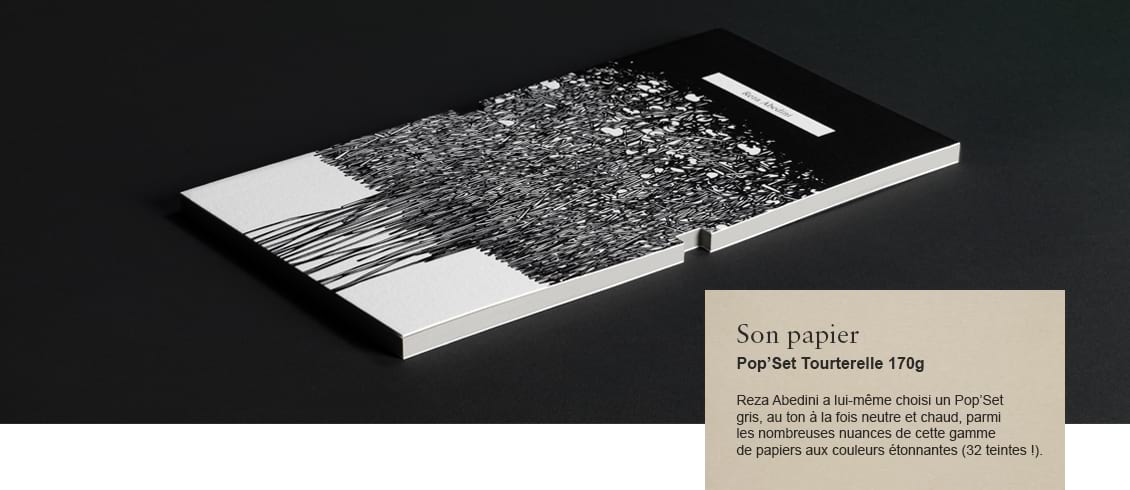
 Title - Callidrawing
Designer - Reza Abedini
Date published - 2014
Do you sketch on paper before translating a design in digital form?
Yes, almost always. Because I really enjoy drawing. When the paper under my hand is nice to the touch, I can reach a design or concept in a much easier and smoother way, at least it feels like that. Therefore, I always have a variety of papers by me, which I use for making notes or sketching. I particularly like coarse, and craft papers.
What percentage of your work ends up printed on paper?
More than 90 percent of my final work is seen only on paper, whether it’s drawing or graphic design pieces. In most cases, when an idea starts to form in my mind, its paper manifests itself at the same time.
How do you make sure that designs that look great when backlit on a screen look just as good once they are printed on paper?
I began work in graphic design at a time when computers and screens did not exist! Or at least, they were not used for design. So the fact that there is a difference between the vision and the final product is a familiar concept to me. It is true that sometimes images on a screen are more clear and eye-catching. But as we know, those images have no physicality. Considering this, I have more respect for a print or real drawing, their tangibility. We must remember that each of these images; digital and physical, engages a different part of us. Each of these can be beautiful, and they have their own use.
At the same time, I’m much more confident when my design starts on paper and ends on paper. Being able to touch the paper during the process of design and drawing has a huge positive impact on my soul. I am addicted to touching paper.
What you can touch is part of the aesthetic of the piece. For example, imagine a series of colors from pastels that are printed on a textured paper. The sense of touch and the visual information both help to remove you from a more commercial atmosphere. Or imagine a series of colored grays that are printed on a coarse paper to give you the sense of concrete. This is a very complex combination of visual communication, functionality and aesthetic.
When you have to specify paper, do you rely on your own evaluation, or do you consult paper specialists?
On particular occasions I always get advice from print-making specialists. They sometimes have interesting recommendations for new materials and techniques but I always make the final decision myself. I take calculated risks when I believe it’s worth it.
Is the archival quality of paper something that concerns you?
With printed material, time has a meaning that is not there with digital pieces. Materials can store and reflect time. This is why we are interested in scrutinizing paintings and watercolors from the 19th century for example, because we can also witness time in them.
Did you know that the sound that paper makes when you draw on it, or when you turn pages, triggers a pleasurable tingling feeling in the brain? Have you ever had an opportunity to take advantage of the auditory qualities of paper?
In my last project I recorded the sounds of drawing letters over and over. I then presented these with the drawn image of each letter. So the audience could look at and hear the sounds of the letter “B” for example. I have also completed a few projects in this field with my students. The entire process of beginning and finishing a project, like touching the paper, listening to the sounds of the drawing, the edges of the paper, are all like a religious ritual to me.
At what point of your design process is the choice of paper a creative act?
As I said, the idea and the materials for the idea tend to come to me at the same time. But it has happened that after the design progresses, I change my mind and think it would look better on a different paper. In recent years, a certain type of paper has become a part of my visual language, like an author who favors certain words.
Can you describe an instance when the choice of paper made a critical difference in one of your projects?
I believe it is possible to change the public opinion and introduce others to new experiences. I can think of a lot of examples, like printing the same work on two different types of paper and seeing how one got a lot more attention than the other; or printing white paint on grey card (which is not easy to do and always come out imperfect) instead of printing grey on white card and leaving some parts white (to simulate the same effect), which create a completely different atmosphere.
What are some of your favorite works on paper by graphic designers you admire?
I have a personal collection of many old posters and books. The type and smell of the paper, and even the printing ink affects me every time I refer back to them. This intimate relationship with printed matter is endlessly enjoyable.