© Goo Han
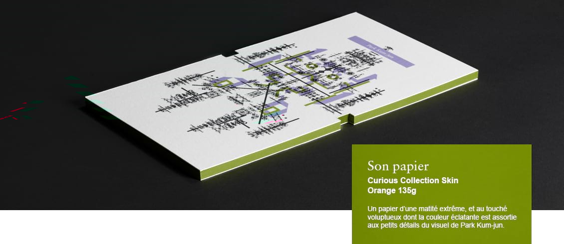
Park Kum-Jun
South Korea
"My work on paper gives away its mystery gradually, one discovery at a time."
Award-winning South Korean designer Park Kum-jun founded 601BISANG, his design agency, in 1998. Over the years, his work has reflected a deeply philosophical commitment to existential values associated with the Korean cultural heritage. For his clients, he designs catalogues, exhibition posters, calendars, magazine covers and conceptual installations. “We not only design for clients – we become clients for ourselves to design what we want,” he says. Several of his most celebrated projects are self-generated. The agency has won countless awards, gold medals, first prizes, and trophies from international design organizations, including, in 2012, the prestigious “Red Dot: Agency of the Year” distinction. This accolade honors the continuously high design achievements of 601BISANG, a studio that is highly respected on the Asian design scene for its relentless creativity. Park Kum-jun is a member of the AGI (Alliance Graphique Internationale) since 2008.
From South Korea, Park Kum-jun shipped a large parcel full of the most wonderful examples of his work. Inside, neatly wrapped, were individual packages encased in elegant cardboard boxes. Opening each of them was a ritual. Some boxes, it turned out, were not only printed outside, they were also printed inside with exquisite motifs. Then came layers of crisp protective paper. The expectation was delicious: by the time you held in your hand the final content – a book, a catalogue, a calendar, a brochure – all your senses were on the lookout: your eyes, your fingers, but also your taste buds. Who knew that leafing through a publication could be a mouth-watering experience?
“Paper is a very sensitive creation that has a life of its own,” says Park Kum-jun. “It breathes and reveals its feelings in its own unique way.” He strongly believes that design is a process that should highlight the inherent beauty of an object. For him this object is more often than not paper. His agency in Seoul handles cultural projects for museums, festivals or special events. He has won so many design awards, it makes your head spin. Everything he touches, it seems, becomes an art piece.
The secret of Kum-jun is his love of hanji, the traditional Korean paper made from the inner bark of mulberry trees. Very substantial, yet soft to the touch, this handmade paper is said to last a thousand years. One of its properties is the irregular way it absorbs ink, creating unforeseen results and bringing spontaneity to designs that might otherwise look too rigid. “Impromptu yet precise,” says Kum-jun to describe the quality he tries to achieve in his work. His goal is to “call attention to permanence” with creations that capture a spiritual dimension.
Véronique Vienne
Interview
Véronique Vienne:
Do you think that there is a danger that we might become a “paperless society?”
Park Kum-Yun:
It is true that mobile devices such as smartphones and tablets are increasingly taking the place of paper. This trend will no doubt continue to expand. However, paper has properties that stimulate our intuition: the feel and smell of paper, which changes over time, cannot be delivered through a screen. I think the crisis that paper is currently facing can be transformed into an opportunity to open up new possibilities and invent new roles for paper.
Though paper may have reached its limit as a print media, its value will keep growing across diverse areas. In fact, the papermaking industry is continuously expanding. Paper is becoming a multipurpose material on the industrial front. The very nature of paper, as opposed to “digital paper,” is contributing to the growth of its value. Paper is re-establishing its identity as a medium that not only satisfies our emotional needs but also helps us explore our creativity.
At what point of your design process is the choice of paper a creative act?
Paper instills emotions into content and form, so I select the paper in the pre-planning stage. Sometimes, an entire plan or idea starts and grows from a specific type of paper. A comprehensive review of the paper selection, the printing method, and the processing method helps deliver the planned intention. However, it is crucial to take into account the communication objectives, the tone and the cultural language of the project.
How do you evaluate the best paper for a specific project?
I focus on looking into what atmosphere, or set of emotions, I want to achieve. An “atmosphere,” or set of “emotions,” in an aesthetic sense, is the result of a tightly knit assemblage of elements, similar to a living organism. One of these elements is paper. In my opinion, it communicates emotionally mainly through its texture, whether rough or soft to the touch.
But let’s not forget the auditory qualities of paper! Once, I created three flipbooks capitalizing on the sounds made by paper. These sounds, in combination with symbols, were intended to stimulate the auditory sense of viewers and lead them to imagine more sounds. I am always trying to push the boundaries of the viewer’s “synesthesia” – his or her ability to process multiple impressions at the same time. Synesthesia is a neurological phenomenon in which one sensory or cognitive pathway can spark secondary cognitive pathways such as color perception or pattern recognition.
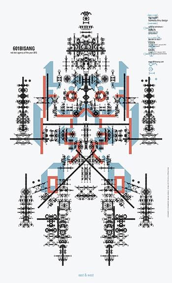 Title - Digilog601: Harmony thru Design / east & west
Designer - Park Kum-jun
Agency - 601BISANG
Date published - 2012
Client - 601BISANG
What other techniques do you use to communicate emotionally?
The way I work requires patience and perseverance, from me, but also from my readers. Paper is ideal for works that involve intuitive text and emotionally appealing, subtly sensuous forms, such as illustrations and typography. I might use ambiguous visual clues to reinforce a specific message or, on the contrary, use symbolic language to suggest different interpretations. For example, an ink smudge may be left on a page as if by mistake and lead viewers to take a closer look at the printed product in search of additional smudges. Sometimes, in order to add layers of complexity, I deliberately disrupt the way people read a book – based on what I call the “aesthetics of inconvenience.” I might create odd cutouts in a poster or a book in an attempt to invite the outside in, and incorporate surprising elements into the composition.
Very often, I make sure that my designs look different depending on from how far or how closely you look at them. They may form one single image from a distance, but reveal a network of sensuous details and delicate shapes when viewed from close-up. Many of my works appear as text from far away – but turn three-dimensional as you approach them.
Another example of the way I communicate emotionally is best exemplified by an experimental yearly publication, the 601 Artbook Project. My goal was to stimulate the readers’ sense of wonder every time they turned the pages. I was careful not to reveal all my intentions at once. I hid symbols and metaphors on different scales, along with the usual visual signs. My work on paper is never understood the first time around. I create publications and posters that give away their mystery gradually, step by step, one discovery at a time.
Can you describe one of your favorite projects?
I am currently interested in re-interpreting Asian values: the harmony of yin and yang, the natural elements such as water, soil, air, and sedimentary layers reflecting the flow of time. So, one of my favorite projects would have to be Digilog 601: Harmony thru Design, a series of four posters I did recently.
The term “digilog” was coined by combining digital and analog. Digital and analog may appear to clash, but they co-exist in a complementary manner. As far as I am concerned, “digilog” design embraces both the rational thinking of the West and the spirituality of the East. My four posters translate this concept graphically, using highly symbolic and ambiguous images, but the overall impression is that of a living, organic system. In general, my work focuses on the concept of interdependence within a greater framework.