
Flavia Cocchi
Switzerland
"I am in heaven when paper representatives come in to show me their latest designs."
Swiss-born Flavia Cocchi was classically trained as a graphic designer in the tradition of Emil Ruder, Josef Müller-Brokmann and Armin Hoffmann. Her practice focuses on typography, with Akzidenz Grotesk a favorite. Printed matter is her love and paper her passion. Before opening her own studio in 1997, she worked for Werner Jeker in Lausanne, for the Anatome agency in Paris, and for Massimo Vignelli in Italy. Today, Atelier Cocchi in Lausanne specializes in books and catalogues for clients in the cultural field. Since 2000, for the Mudac (Musée de design et d’arts appliqués contemporains) in Lausanne, Cocchi has designed more than a dozen books, as well as countless posters, catalogues, brochures and collaterals. She is a member of the AGI (Alliance Graphique Internationale) since 2012.
In Switzerland, Atelier Cocchi is the design studio of choice if you want a book, a catalogue or a brochure that speaks to your senses. For Flavia Cocchi, turning pages is an experience that engages the eyes, the mind, the ears, and the fingertips. The publications she creates are the visual equivalent of mouth-watering gourmet dishes.
When prospective clients come into her studio in Lausanne, she is attentive to their likes and dislikes. “As soon as they walk in, I try to imagine the kind of paper that would be right for them,” she says. She gives them small bites to taste. “I show them samples of my work – books, catalogues or posters – and observe how they react. As we discuss their project, I try to get a mental image of what would be right for them.” For an architectural firm, she might imagine a puffy watercolor paper. For a museum, her intuition might suggest inserts in translucent vellum. For a photographer, she might picture a very smooth, uncoated cream-colored stock.
However, pleasing clients is not as difficult as pleasing herself. To be satisfied, Flavia Cocchi feels that she must control every step of the printing process, from the paper selection to the last stitch of the binding. “And when something is not exactly the way I think it should be, I feel like crying,” she says, “… and sometimes I do cry, even though clients are seldom as finicky as I am.”
Véronique Vienne
Interview
Véronique Vienne:
So you always begin a project with your choice of paper?
Flavia Cocchi:
Yes I do. It’s what triggers my creativity. I always try to mix papers in my books. If I use coated paper in a photo section, I will choose uncoated for the texts, to give that part a more precious, sensual feel. Or else I print the text on almost transparent stock, like Bible paper.
One of my favorite books is a catalogue I did in 2008 for Mudac, the Musée de design et d’arts appliqués contemporains in Lausanne. It was for an exhibition featuring decorative tangerine paper wrappers – the kind used to wrap top quality, imported citrus fruits from Italy or Spain. I used an ultra-thin, fifty gram, crinkly stock, like the real thing. You know, the kind of paper you can’t help but smooth with your hand and keep safely between the pages of a book.
Are your Swiss clients as quality-conscious as you are?
They are – and that’s why I came back to Lausanne after working in France for a while. The standards of workmanship are so much higher here. One can observe a loss of quality on a global scale, but it’s happening to a lesser degree in Switzerland. If you care enough, you can obtain exactly what you want here, whereas elsewhere it’s no longer possible. And I am exacting: the finishing touch is everything for me. That’s why I do not design digital interfaces such as websites: there is no materiality there, no tactile interaction. I refuse to get involved with a project, unless I can manage everything, down to the last detail.
This love of precision is very Swiss, isn’t it?
I am very Swiss indeed: I am precise, but also minimalist. I believe that empty space is more attractive to the eye than space that is filled with lots of stuff. White space is not empty. White for me is a color, particularly when it is silkscreened. I often work with a printer who loves to experiment with silkscreen techniques, and encourages me to do so. For example, I might silkscreen a white grid on top of white paper, or I might print on both sides of a semi-translucent paper.
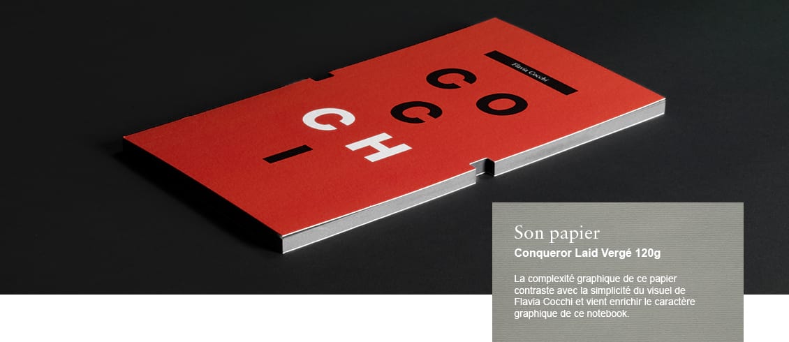
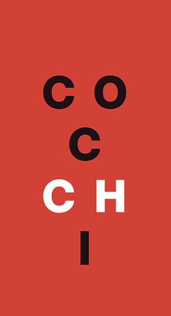 Title - COCCHI - (Personal exhibition “Flavia Cocchi, graphiste”)
Designer - Atelier Cocchi
Date published - 2010
Clients - Galerie Anatome, Paris
mudac, Lausanne
Museum fur Gestaltung, Winterthur
What’s the most fun part of the process for you?
It’s when paper representatives come in to show me their latest designs. I am in heaven. All the samples get me excited about new possibilities. I can’t wait for the right opportunity to use this or that paper – and when it arises, I call the representative at once, request more information, and order a mock-up to show the client.
Are printers as helpful as paper representatives?
Talking with printers is just as important. They know how to get the best results, but, as far as I am concerned, they are not the main authority when it comes to paper specification. Once, to economize paper – and to save money – a printer cut some of the pages of one of my books against the grain – against the direction of the fibers. I could hardly keep the book open. It was warped: a very bizarre sight. The paper couldn’t roll in the direction in which you turn the pages.Talking with printers is just as important. They know how to get the best results, but, as far as I am concerned, they are not the main authority when it comes to paper specification. Once, to economize paper – and to save money – a printer cut some of the pages of one of my books against the grain – against the direction of the fibers. I could hardly keep the book open. It was warped: a very bizarre sight. The paper couldn’t roll in the direction in which you turn the pages.
Are all beautiful books necessarily expensive?
Oh no! I consult with both paper representatives and printers to try to keep the cost of books down. However complex books or catalogues might be, they should always be priced moderately. They have to be affordable. Otherwise no one buys them. And what’s the use of a beautiful book that sits on a shelf?
Where does your fascination with paper come from?
A big influence in my life was my father, an architect, who loved to draw. He drew for me every night, before tucking me into bed. He would tell me stories, and, as he spoke, he would draw pictures of people, monsters, castles, and fabulous architecture. I kept the pieces of paper with his sketches, scribbles and pencil strokes. Over the years they got folded, crushed, torn and wrinkled, but remain precious nonetheless.
How do you foresee the future of paper in the digital age?
I think beautiful art books are here to stay but I am most worried about the future of the press. How about newspapers, pamphlets, tabloids, fanzines, cheap comic books, and pulp fiction? I love fine stock, but I also love stuff printed on paper that turns yellow with time. Like my father’s crumpled drawings, these most humble examples speak on behalf of our humanity.