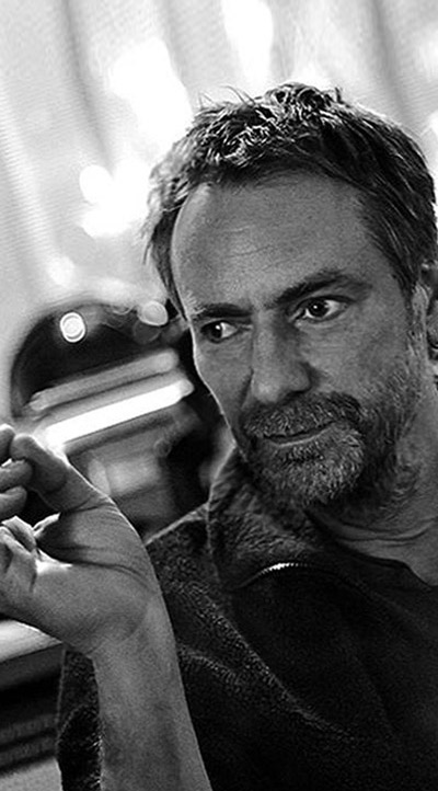
© MB
Michal Batory
Poland
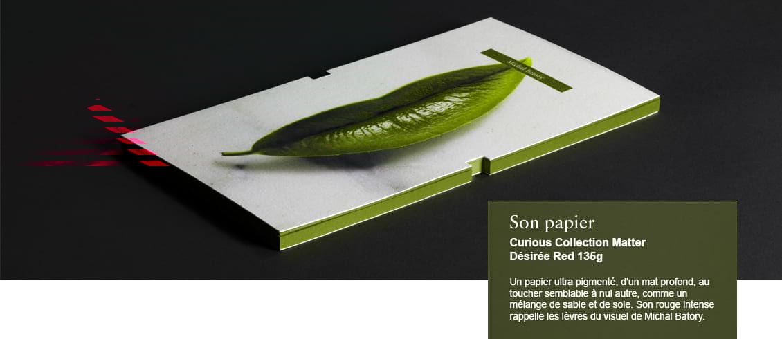
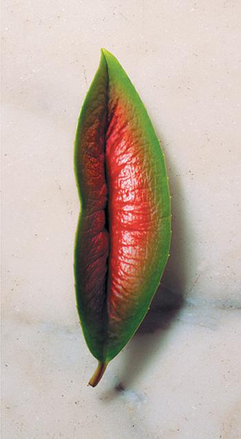
"If you pick the wrong paper, there will be no magic."
Born in Poland, Michal Batory studied graphic design at the National Art School of Lodz, then under the communist regime. A greater influence on his sensibility was the street, where clever, colorful posters provided a relief from the dreary routine of everyday life. In 1987, Batory received a prestigious grant from the Polish Ministry of Culture allowing him to print his posters using the silkscreen technique. A year later, he moved to Paris in search of work opportunities. He never went back to Poland but instead settled in the French capital where he made a name for himself among local graphic designers. From 2001 to 2008, he was in charge of communication for the Théâtre National de Chaillot, for which he created a series of legendary posters. All along, even though he lived in France, he was working for publishers and cultural institutions in Poland, and his work was featured in poster shows worldwide.
Michal Batory is a Polish artist who crafts strange talismans: a smartphone shaped like a Neolithic arrowhead, a yellow balloon sporting an aviator’s cap, a loaded gun made of rolled film strips. His hybrid metaphors incorporate crowns, wings, skulls, lips, flowers, footprints, corsets, and bloody fingers. Photographed against brightly colored backgrounds and printed on posters, they become jaw-dropping visual concepts – giant surrealist artifacts more real than the real thing.
Making this happen is not unlike pulling a rabbit out of a hat. The trick here is the choice of the paper on which the poster is printed. “If you pick the wrong paper you can never get the colors you want,” says Batory. “Never. However hard you try, your oranges will be brownish and your greens will be khaki-dirty. There will be no magic. No wonder. Nothing.”
Batory’s home in Paris, in a back alley, is part workshop, part photo studio, part design agency, part garage, part atelier, part greenhouse. Large cheerful posters contrast with this subdued “La Bohème” décor. The intensity of the cadmium yellows, pure magentas or peacock blues is reminiscent of the Polish posters designed by the likes of Jan Lenica or Roman Cieslewicz. In this quiet northeastern corner of Paris, you could be in Warsaw, in an artist’s loft in the edgy Praga district. These days, most of Batory’s commissions come from clients in Poland. Famous in France for his campaign for the Chaillot theater and for a number of prestigious festivals, Batory is also a major figure on the Polish graphic design scene.
Véronique Vienne
Interview
Véronique Vienne:
Poland is known for its conceptual posters. Can you explain why?
Michal Batory:
The modern poster was invented in Poland in the 1950s, under communist rule, as a reaction to censorship. People used to laugh at the stupidity of the censors who never got the irony, or the political message, hidden in these images. Making fun of censors was almost a national sport. That’s why my Polish posters are more provocative than those designed for a less politicized French audience. In Poland, the public is used to shocking images showing bones, guts, blood, gore, nudity, and severed body parts!
You sometimes use photoshop, but your 3-D collages never look computer-generated. What is your secret?
I create surrealist objects using ordinary, everyday things. I start with sketches on paper to figure out the concept, and only then do I begin to carve, sculpt, and assemble the hybrid forms I have in mind. Sometimes I do not have to retouch the images at all. My posters are compelling because I build the objects to the right scale, so the perspective, the lighting and the textures are completely naturalistic. The quality comes from there. And from the way the colors look once they are printed on the paper I choose.
Can you explain why the paper makes such a difference?
Uncoated paper will absorb the ink, spread it, plug it – and the color definition can be less vibrant. So, in theory, coated paper is better to reproduce photographs. But you have to select the right kind of coating. How thick? How water resistant? What is the best finish: matte, semi-gloss, or high-gloss? The final result is often a question of judgment: Which part of the image should you privilege, the light areas or the shadows? How subtle should the gray scale be? How black do you want the black to be?
Look at the difference between these two reproductions of the same poster in two different books. In one book, on coated stock, the image is bright, cheerful – but a little flat. In the other book, printed on a thicker stock of a higher quality – a beautiful uncoated offset paper – the image is richer, fuller, with more detail. It has a lot more impact.
 Title - Berenice
Designer - Michal Batory
Date published - 2001
Client - Théâtre National de Chaillot, Paris
You design posters but also book covers. Are the rules different?
Yes they are. The coated versus uncoated rules are not always correct when it comes to books. Coated paper is usually whiter, so it’s better? Yes and no. Sometimes, for books, I prefer a more yellow paper – and I compensate for it at the color separation stage. You have to be ready to challenge the conventional wisdom to obtain what you want.
You also have to choose the paper depending on the viewing conditions of the images, whether it’s indoors or outdoors, on the cover of a book, on a postcard, or inside a catalogue. My posters have been reproduced in so many different situations, I am aware of how different the results can be, depending on the nature of the surface on which they are printed.
How did you learn to choose the right paper?
Choosing paper requires the kind of savoir-faire and experience that few designers have today. Most art directors do not take the time to go speak with printers or paper representatives, to pick their brains or ask them for advice. And they might never understand why a result is disappointing. They’ll think it’s the fault of the photographer, or the printer, or they might not even be aware that there is a problem.
Nowadays, we just glance at images on a screen – we no longer know how to contemplate images on paper. Would you agree that printed pictures are more enjoyable because we don’t rush so much when looking at them?
We do rush! The problem with posters displayed in the street is that, more and more, they are on rotation. They remain stationary only for five seconds. They are really there for people on the move, for people in cars – for drivers more than for pedestrians.
Most people, whether driving or walking, can’t decipher more than 50 or 30 signs in such a short time. The forms I create must be first and foremost understandable in the street, in a hurry. My images can de “decoded” by ordinary people. For me the most important thing is the message. I am an “affichiste” which means that I am more interested in the concept than the form.
Eventually my posters are reproduced on line or in books. Only then can you begin to appreciate the work I put into it. However, even though they are beautiful – their vivid colors are part of their appeal – beauty is not their primary function.